The iOS App Icon Book
On November 9, 2021 Michael Flarup and a team of 4 others launched a Kickstarter campaign that celebrates the craft of iOS app icon design. I was ready on launch day to support this project, and as it turns out I ended up being backer #1, which I thought was pretty cool :)
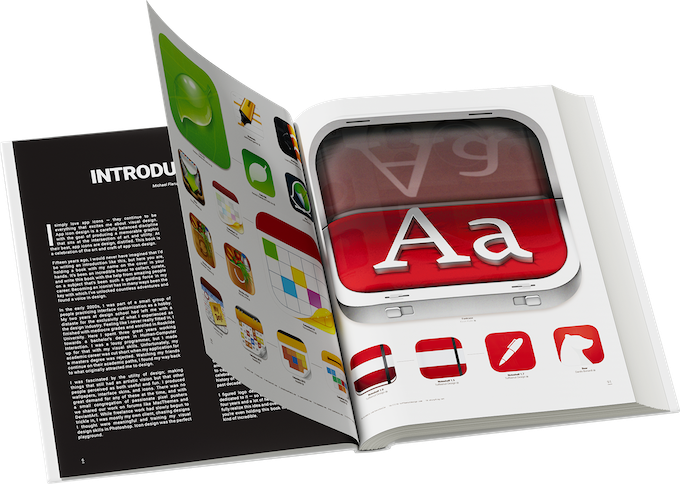
This beautiful coffee table book will feature hundreds of iOS app icons that have been created over the years, along with thoughtful write-ups and interviews with prominent icon designers who will take us behind the scenes of icon design, and share stories and insights into their work over the years. I am very excited about this book, and I can't wait to get my hands on it.
The Kickstarter campaign closes on December 16th, 2021 so at the time of writing this, there is still time to back this project! View the Kickstarter campaign.
From the beginning
Ever since the first iPhone came out, I've been enamoured by the look and feel of app icons - to the point where most of the time I won't even download or use an app that has a poorly designed app icon. Some exceptions apply of course, but those apps live buried in a folder on the last page of my Home Screen pages.
Prior to the release of iOS 7, iOS app icon's were highly detailed and often quite literal in their design language (i.e. newsstand looked like an actual newsstand), a design trend that is known as skeuomorphism. I personally loved many of the icons from this era.
iOS 7
When iOS 7 launched on September 18, 2013 it brought with it the biggest design change to iOS since the debut of the iPhone. Apple chose to go with a flat design for their icons, slimmer fonts, and a more simplified colour scheme. Due to the radical interface change, there was a lot of controversy around this update (people don't like change), but it did bring with it some much needed change as well.
Following iOS 7, there were a few years where developers overhauled their iOS app icons to favour this new, flatter design style. Personally, I thought we swung too far in that direction and am happy that we are finally coming back to something in the middle. Some of my current favourite icons include 1Password, Overcast, Halide, Deliveries, and Tweetbot.
I couldn't be more excited to flip through this book when it arrives sometime in 2022, and proudly display it in my office for years to come!
Thanks to this team 🙏
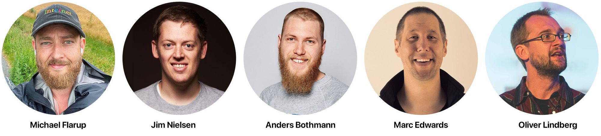
Thanks to the team behind this book enough for bringing this project together over the past 4+ years - truly a remarkable feat driven by passion. THANK YOU Michael Flarup, Jim Nielsen, Anders Bothmann, Marc Edwards, and Oliver Lindberg. You guys rock!
Update: After tweeting about this post, Michael Flarup replied with this:
Thank you for being backer #1 and for writing about why the book excited you, Bob 🙏 https://t.co/ZN7pPCGW1d
— Michael Flarup (@flarup) November 25, 2021